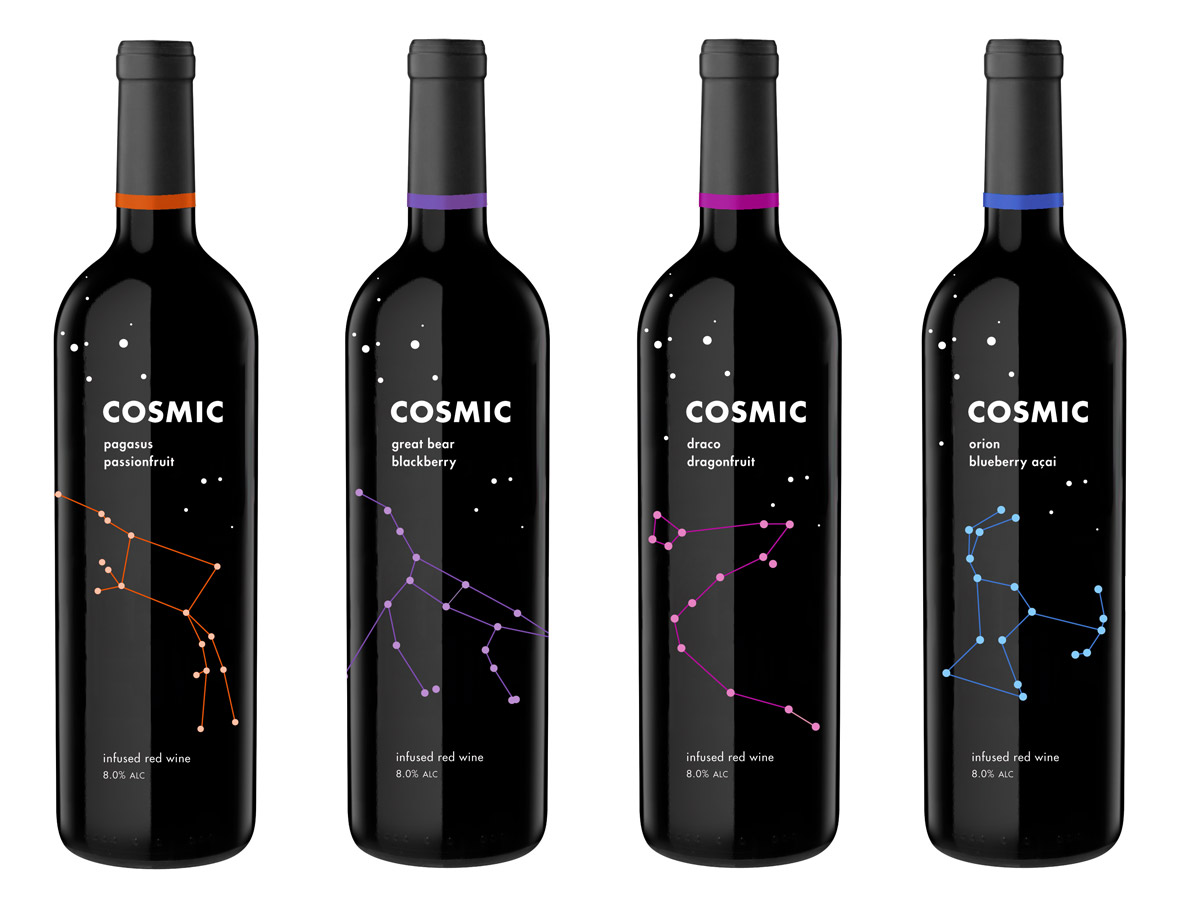
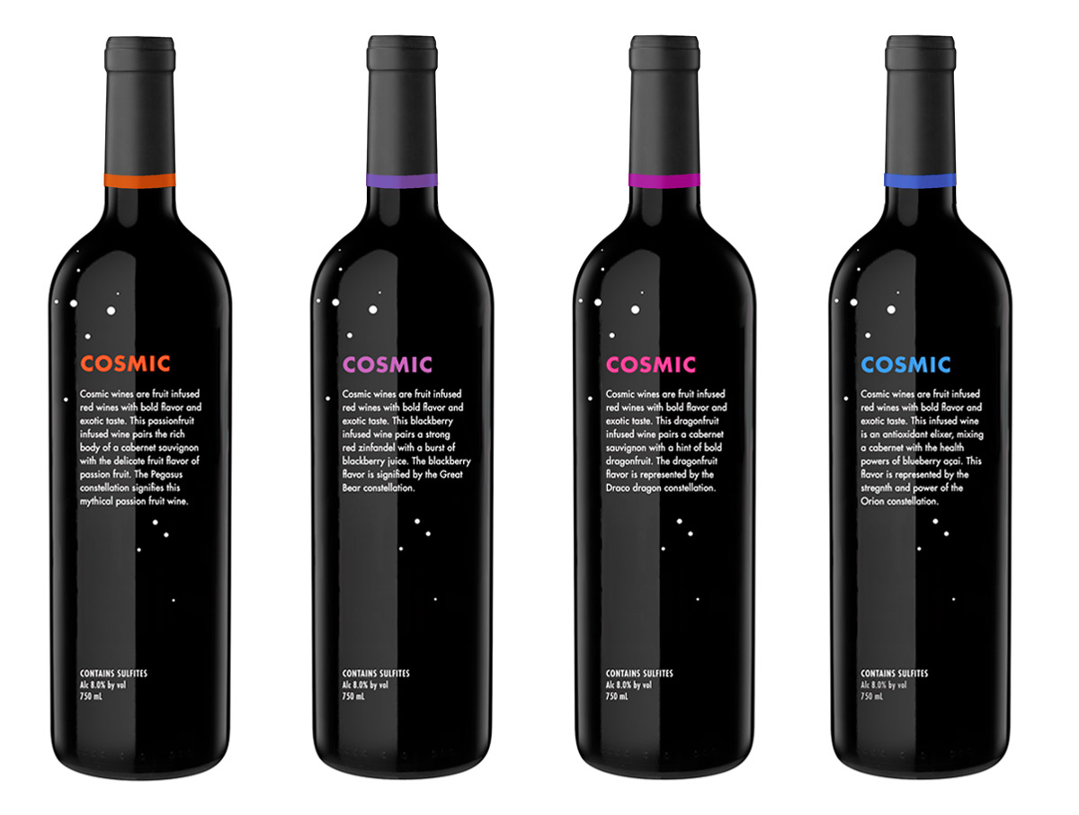
A good package design is a beautiful thing – I've bought products simply because they had a pretty box or a unique shape. With this project, I found an underutilized market for design: wine. So many wine labels are dull, drab, and blah. I came up with the idea of Cosmic Wines: fruit-infused red wines with a constellation theme and bright, punchy colors against a dark, galactic background.
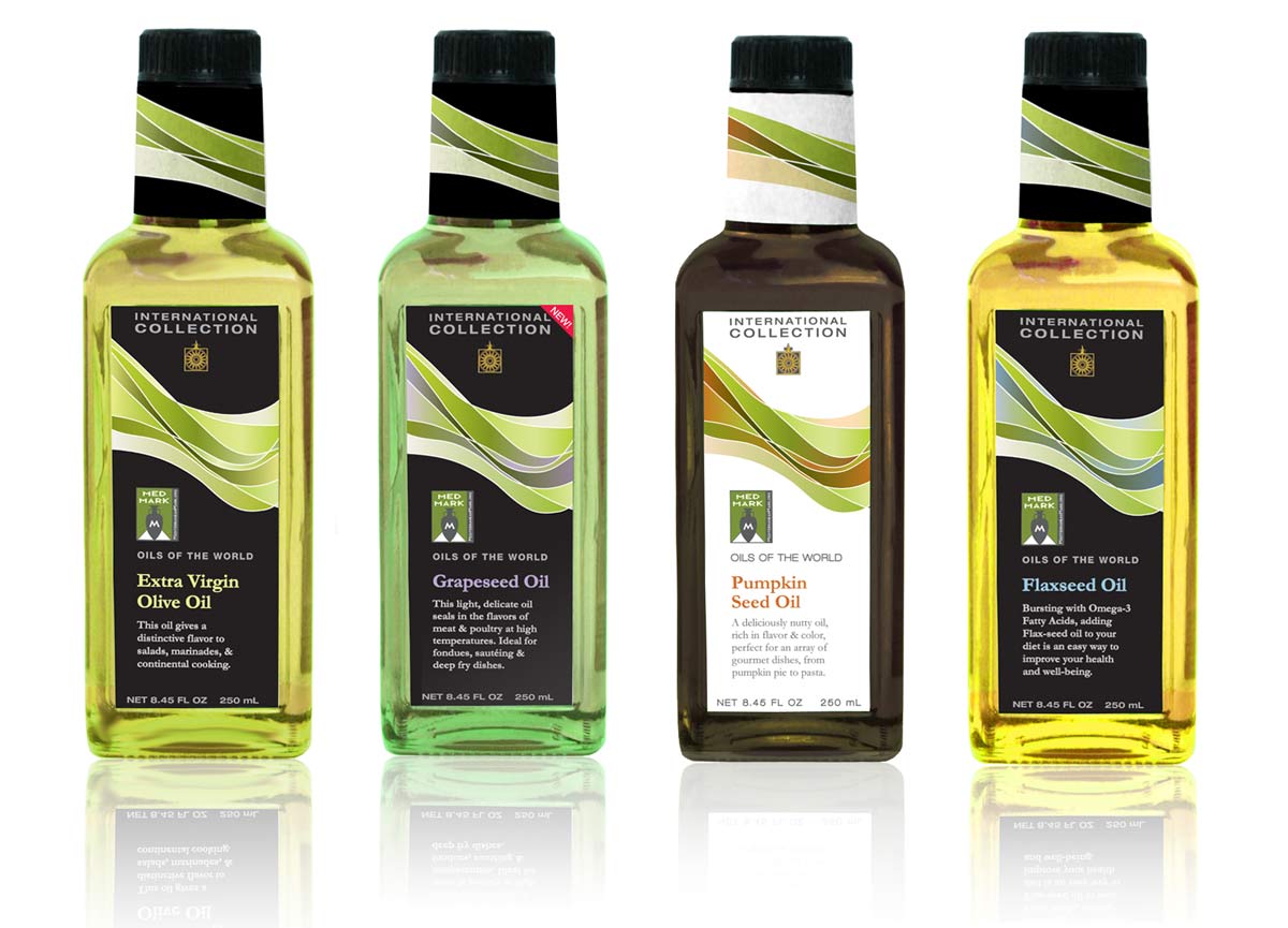
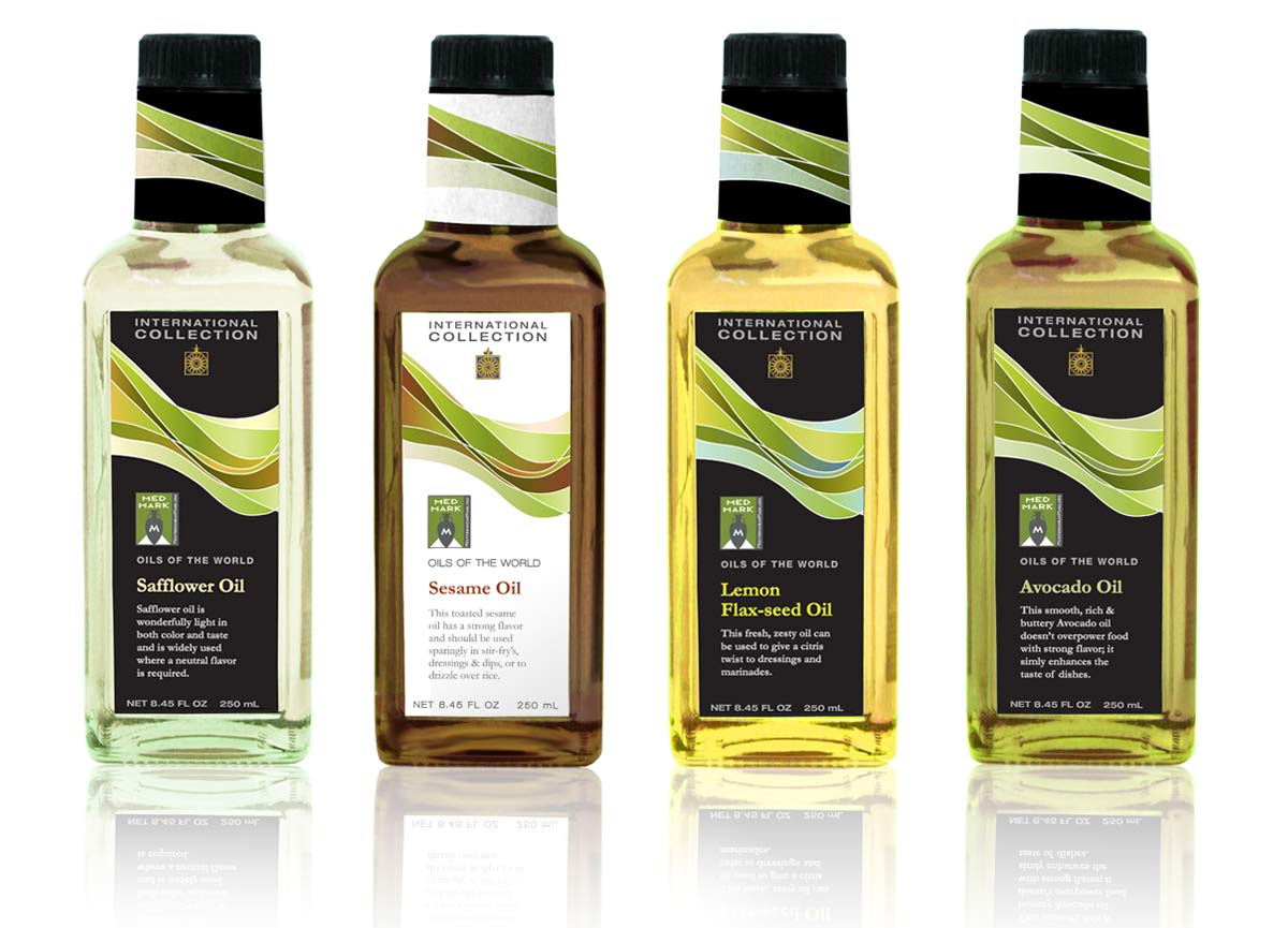
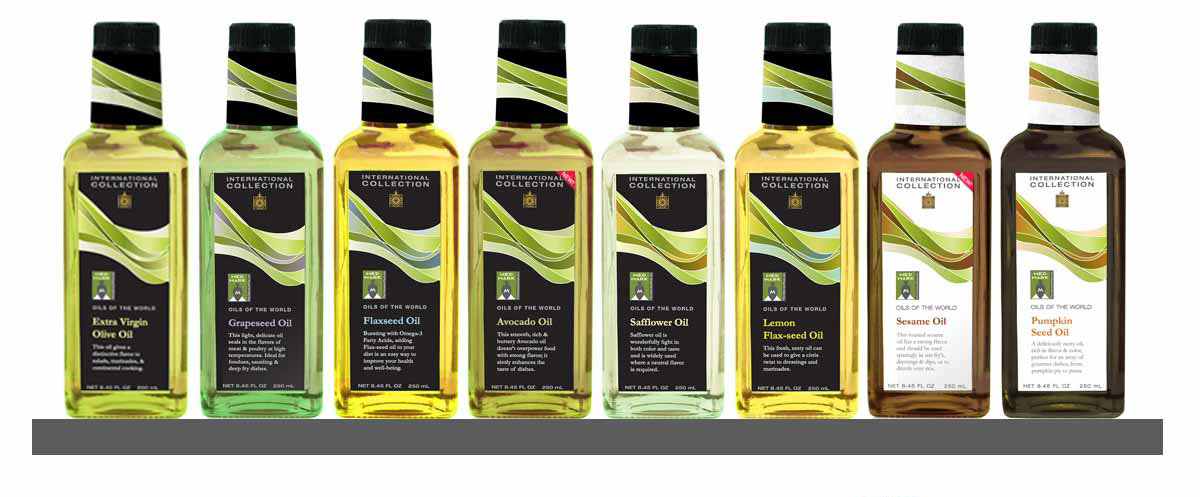
One of my favorite things to do is find something with bad design and reinvent it. For this project, I walked through the grocery store and found the worst packaging I could: that undesirable honor went to International Collection's specialty oils. I gave myself two parameters. 1: Keep the existing bottle shape. 2: I have to reuse their existing logo and "Med Mark" badge. I came up with a fluid design that speaks to the viscosity of oil and creates a distinct pattern on the shelf.
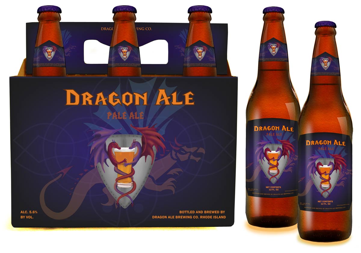
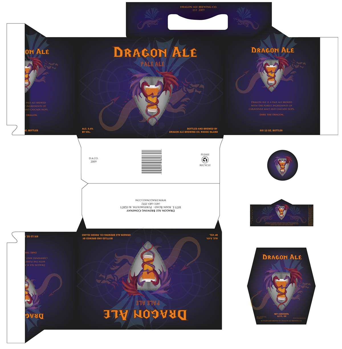
This is one of the first design projects I ever did many years ago, but I'm still fond of it. I may or may not have had a slight obsession with dragons in middle school, so when we were asked to create a beer packaging in a RISD class, I naturally thought of Dragon Ale.